


UPDATING MY MILLENNIAL IG STORIES
You’re Doing It All Wrong (But Lovably So)

It was late afternoon, I was horizontal on my couch, phone in hand, aimlessly scrolling, when a video popped up breaking down the differences between Millennial and Gen Z Instagram stories.
I rolled my eyes and scrolled past. I couldn’t even tell you who posted it. I dismissed it that fast. I mean, who even post those outdated story things anymore?
In my defense, this is my job. I create content for a living and, over the years, I’ve had access to behind-the-scenes workshops directly from the platforms themselves. I’ve made small adjustments along the way (nothing drastic all at once), but they’ve added up to a completely different look over time.
Still… that video stuck with me. It kept echoing in my brain.
A few days later, during my usual scroll-through-my-friends’-stories routine, I started seeing them with new eyes. And—uh oh—they do those things. Not just one or two people. A lot of them.
Look, I’m not here to shame anyone. Call them “mistakes” if you want, but really, you can post whatever you want, your social media is yours. That said… some of it does look dated.
The problem is, social media tools evolve constantly. If you haven’t updated your habits in the past decade, you’re probably still using formats that made sense, you guess it, a decade ago.
So I’m here to give you a quick refresh. I’ll point out the things you might still be doing that are fully stuck in 2014, and show you how they’ve evolved. Then you can decide what fits YOU now in your IG stories.
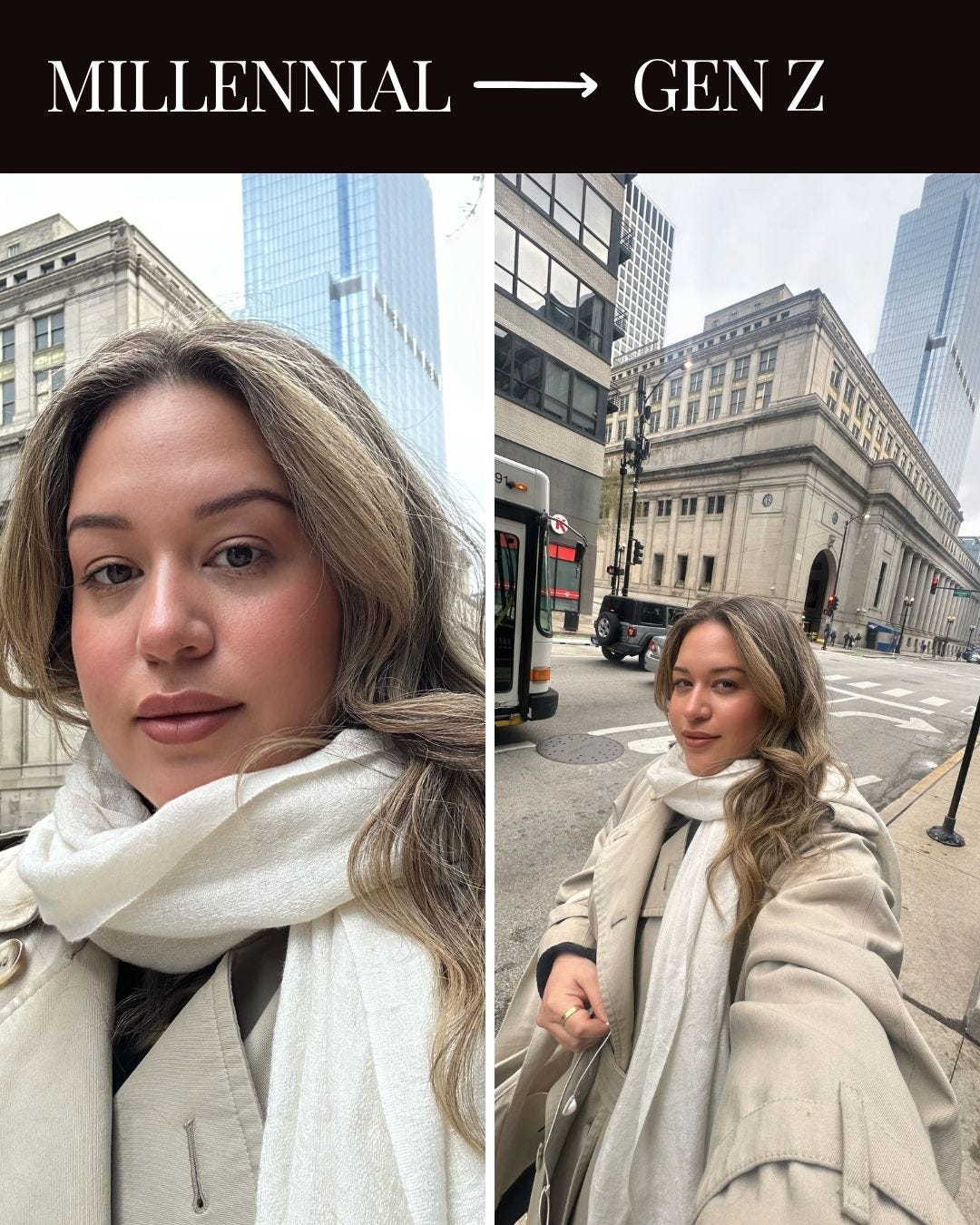
The #1 Sign You’re a Millennial (or Older)
Horizontal photos. Square photos. Basically, anything that’s not full-screen vertical. That’s the dead giveaway.
I remember resisting the switch back in the day. Vertical felt chaotic, too immersive. Gave me a headache. But once I started making TikToks, my brain adjusted. Now vertical feels natural, like the default.
Part of that resistance came from muscle memory. We used to hold our phones like little point-and-shoot cameras, horizontal was the norm. And by the way, the new iPhone kind of brings that vibe back, with the click button on the side of the phone. But it hasn’t caught on. Vertical is the standard now. That’s how we post. That’s how we scroll.
And if you’re thinking, “I take horizontal photos because I want to fit more in the frame,” just use the 0.5x lens. No excuses.
Too Much Happiness Can Be Overwhelming
GIFs might be the number one way to feel like you’re using new features, adding movement to an otherwise okay photo. Unfortunately… they also feel very cheesy.
A solid substitute? Emojis.
That said, I’ll give you a pass. I like GIFs too. 😅
Enjoying this post? Like it so I know what to make next. Think a friend would love it? Share away!
Overly Filtered, Overly Dated
The filters that Instagram offers for Stories are not great. They tend to push extreme tones, and you can’t adjust them. Using filters like Paris, Los Angeles, Oslo, Lagos, Melbourne, or Jakarta on Stories makes your content look outdated. Period.
The best option is to skip the heavy filters all together or edit your photo using the Lightroom app. And speaking of that, I just launched my new Lightroom preset pack: HONEY PACK ✨
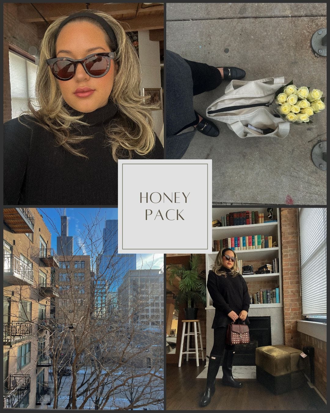
If you’ve never used a preset before, it’s basically a file that applies my exact photo edit in one tap. You download it, install it in Lightroom (takes just a few minutes, and you only need to do it once), and voilà, your photo is edited. You can keep it as-is or use it as a starting point and tweak from there. Either way, it makes the editing process way faster and keeps your photos looking cohesive.
This pack is designed for soft, natural edits, very on-trend right now. It plays with tones and subtle tools to give you that signature underexposed, honey-toned look.
Think effortless, warm, and aesthetic. And yes, it looks amazing across your whole Instagram grid.
You can grab the pack here
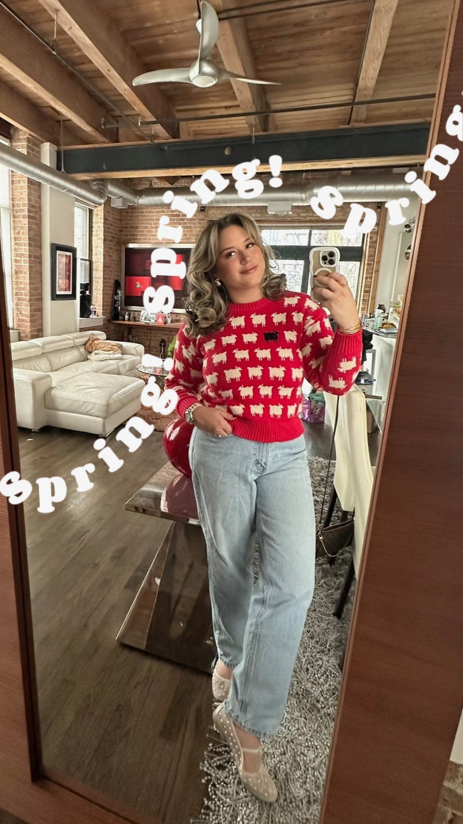
The Font
Text that’s too large, tilted, and randomly placed looks outdated. Many of us still default to strong fonts, simply because they’ve been around the longest. But with the newer options, Gen Z leans toward fonts like Elegant, Literature, or Typewriter. The text stays small, straight, and carefully placed.
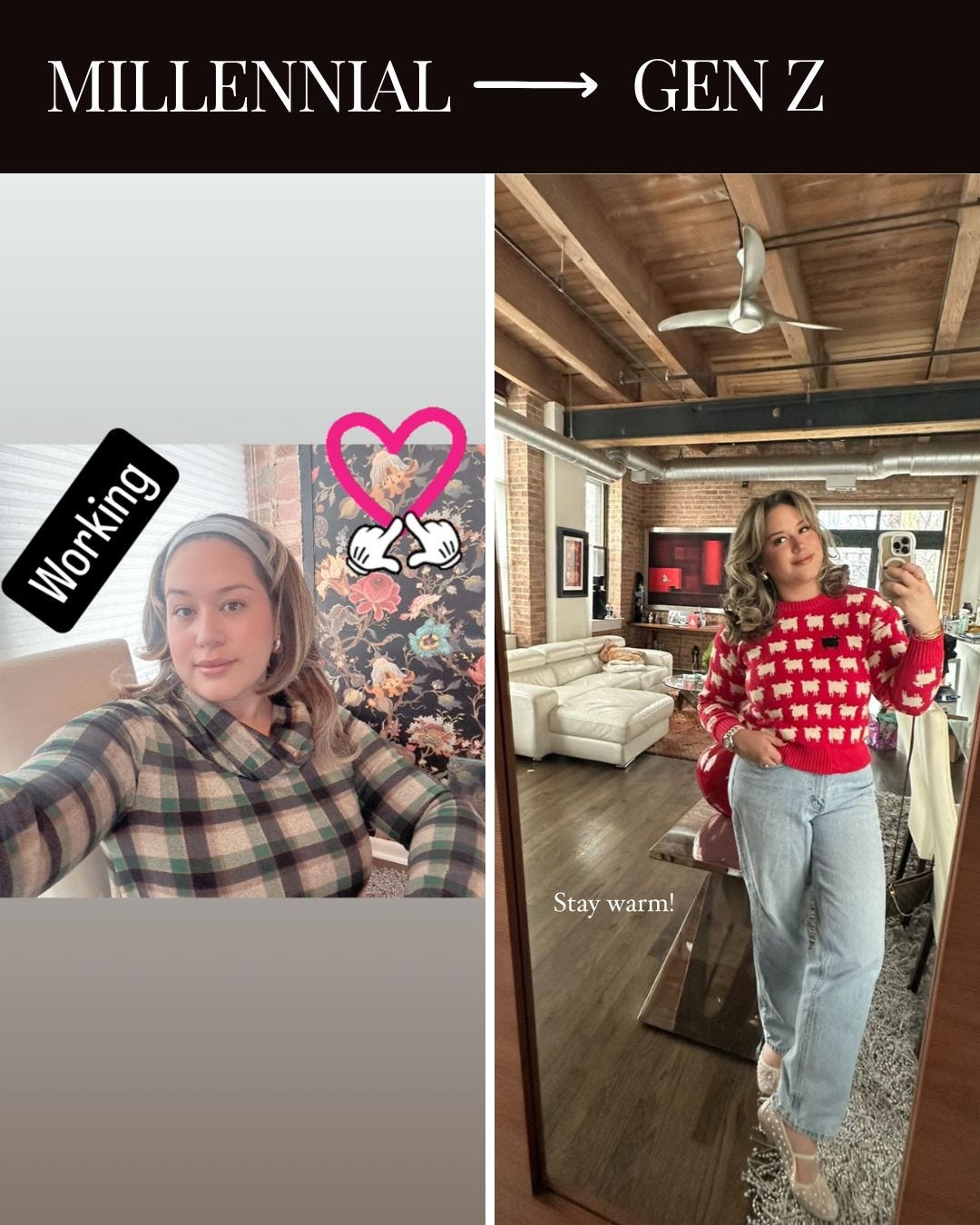
Their color choices are simple. White, black, maybe a soft neutral. Nothing that competes with the photo. The text isn’t there to shout, it’s clear, clean, and part of the image, not slap on top of it.
There’s also a playful side to IG Stories and carousels that leans into fun, creative text, like the wavy font you’ll see in the photo below.
If you want to learn how to create this look, I made a quick video tutorial using the easiest app for the effect, plus a step-by-step walkthrough right below.