


Spring Curated Copybook
Fashion, makeup and more to pose this season

Hey, I’m Bonnie and welcome to a 🔒 subscriber-only edition 🔒 of my Friday newsletter. Each week I share insight into the art of being photogenic, including how to pose, what to wear—fashionable style, makeup—and a lot of whatnot that may benefit your photo. Why, because you can do all that with a phone camera.
Introduction to Lookups Volume I
You’ve probably seen parts of this clip before. You will—I hope and predict—enjoy reseeing them and reading the rest. Permit me a few paragraphs to explain.
The typical literary collection—a “best of this” or an “anthology of great that”—is a large and wide-ranging volume. It is seasoned (if not filled right up) with impressively challenging works. Each collection reflects, I suppose, the extensive learning and sophistication of the editors who assembled it. It also reflects, surely, what the publisher believes its customers desire. More power to ‘em.
This little volume you are seeing is similarly reflective. But it reflects something different. The publisher imagines its subscribers will like a curated copybook focused on the simplest of spring infographics—fashions, makeups, poses—smoothly strung together with images in well-made photographs. The standard for selection here is not whether a look qualifies as the best of its kind or even as merely great. Gravitas carries no weight. What does count is whether a look is, somehow, engagingly easy. That does not mean light or inoffensive or comfortable (Indeed, some of what appears here was designed at least partly to make viewers uncomfortable.) What it does mean is attractive—that is, a kind of look that draws you back in. A kind of look you feel like reposting just because you’d like to see it again, not because you feel duty-bound or otherwise obliged to like it. Easy on the eyes. That is all.
That is not to say you cannot enjoy this volume if you happen to be an artist of extensive learning and sophistication. Rather, it is merely to say that what these posters have given us is stuff that is simply trending. If anything here turns out to be, for you, more than that, consider it typographic frill. And in this context, you can play dress-up without much risk of indignity. The fashion plate and the fashion victim sit side-by-side on these Web pages, and no one will have a clue about which is speaking to you, unless you squee, or weep. So please, read and enjoy.
The arrangement of this copybook is straightforward. Each article containing samples (as in the style of trends or seasonal looks) is prefaced by a picture for the reader to imitate. Each is followed by hypertext just in case you’ve been amused or annoyed or moved in some other way to the checkout of a Web page or site, and feel the need to test it out yourself or go to the fitting room for a try-on.
Now carry this little tablet with you or leave it on your phone so you can use it someplace—where it can be a convenient lookup when you have a moment for a snapshot.
To help you get through the tangle of fashions and cosmetics and people before this season’s newest line trends deeply into social media, following is a number of steps you can take to spring across the platform, inviting those who shared your views to follow you:
Introduce your selfie to seasonal color.
Don’t just say your vanity egged you on, compose yourself with makeup.
Go wild.
Curate the look for less with these discount codes and current sales.
1. Introduce your selfie to seasonal color.
If you want the flow of social media to trend your way, you need to know how affairs of such great moment are trending. In other words, to give your photos the color of spring, you first have to know the trendiest spring color. You might think of mimicking some great influencer or trend forecaster Well, color me jealous.
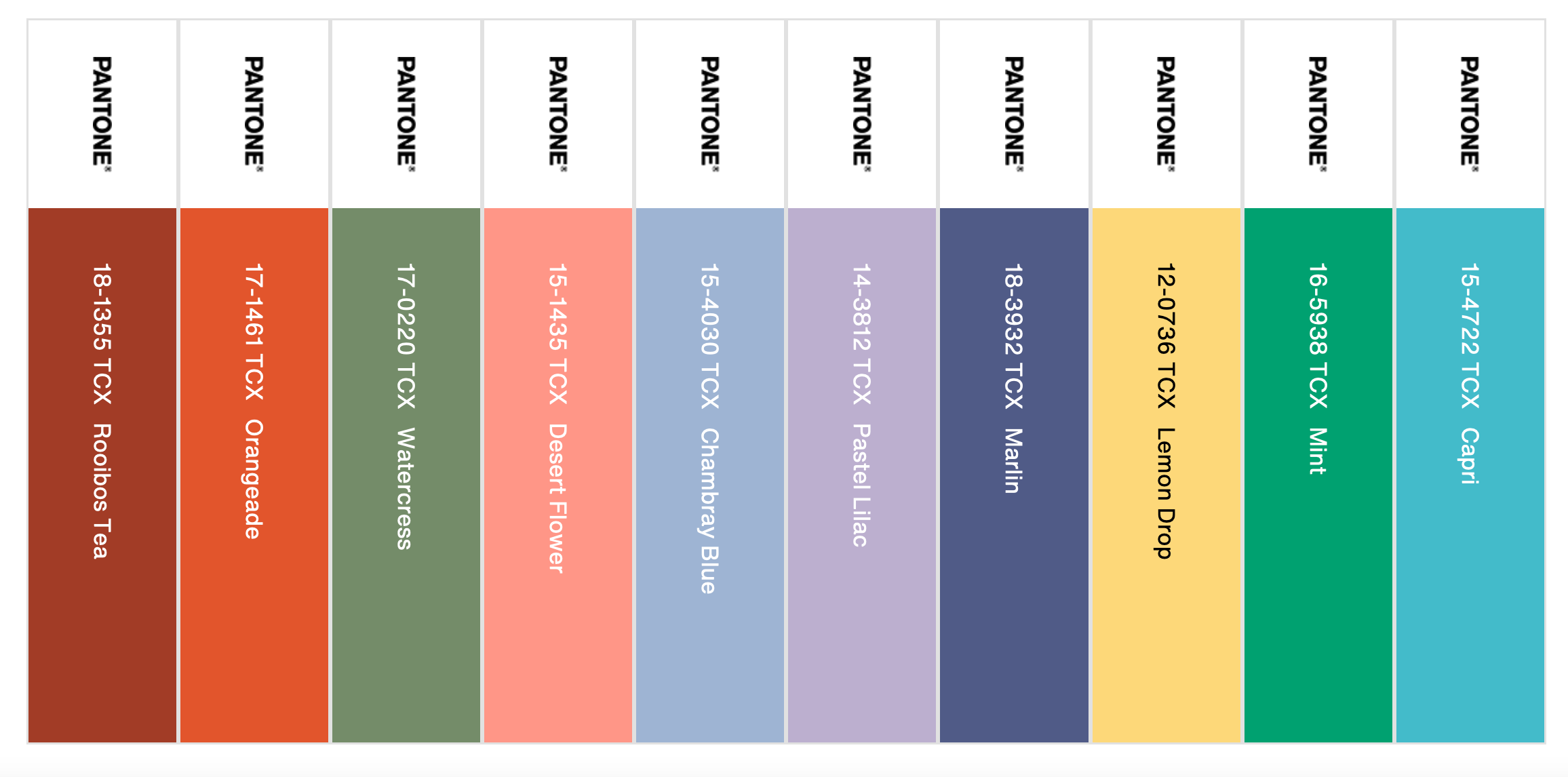
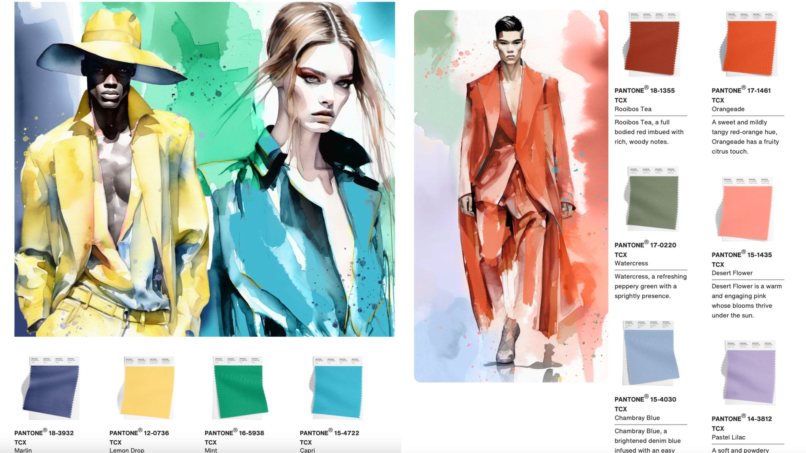
Surely, from the impossibility of a Renaissance man reaching the rainbow, at whose foot a pot of gold is said to be buried, a trend forecaster could utter oracles of Delphian ambiguity after a fashion. Indeedy Pantone has:
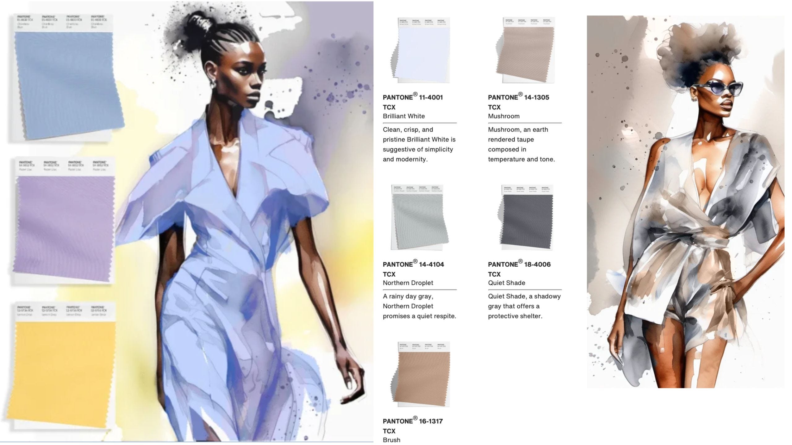

Along with the inaugural collab of PRL x Naomi Glass, making almost the entire palette work together to honor Navajo heritage and centuries-old weaving traditions, what makes this struggle possible, even inevitable, is the lack of national consensus on the colors and scope of spring fashion.

The seasonal election results are in, and the winner of this year’s spring color is … blue! But before we deal with the optics, you need to understand a little about colors—how fashion photography is designed.
The Vogue, Marie Claire, L’Officiel, and Elle data arranged in descending order following spring fashion week was a catchall large enough to hold a rainbow of opinions. With a bevy of media and social hacks on their trail, they hopped over to the Newseum for an after party there, where the multicolored and glittering array found the doors shuttered, proof that early birds were not following a rainbow in search of white (= free from color), gray (= dull in color formed by a blending of white and black), and metallic (= a variable color having reflective and iridescent properties similar to those of a freshly cut surface of a metal) as gold averaging deep yellow. Forget all that.
Imagine a color wheel, the spectrum arranged in a circle. A monochromatic palette consists of one color in a variety of shades. An analogous palette uses colors that appear side by side on the wheel: green, blue, and purple, for example. Placed side by side in a picture, complementary colors brighten each other, for example: blue and orange, or blue and either color in the combo thereof red and yellow.
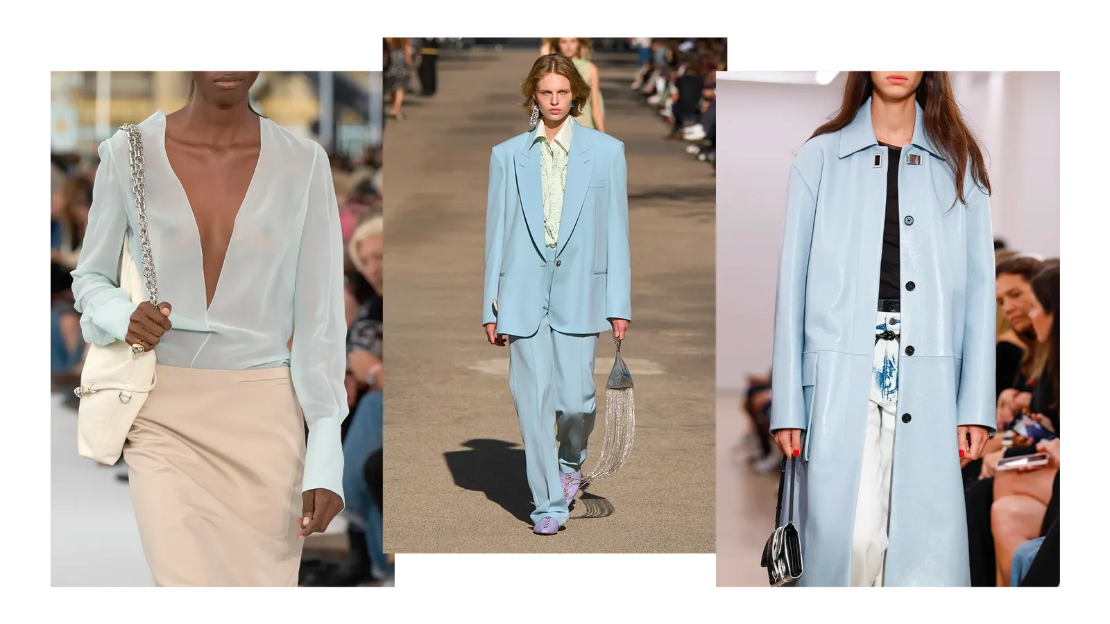
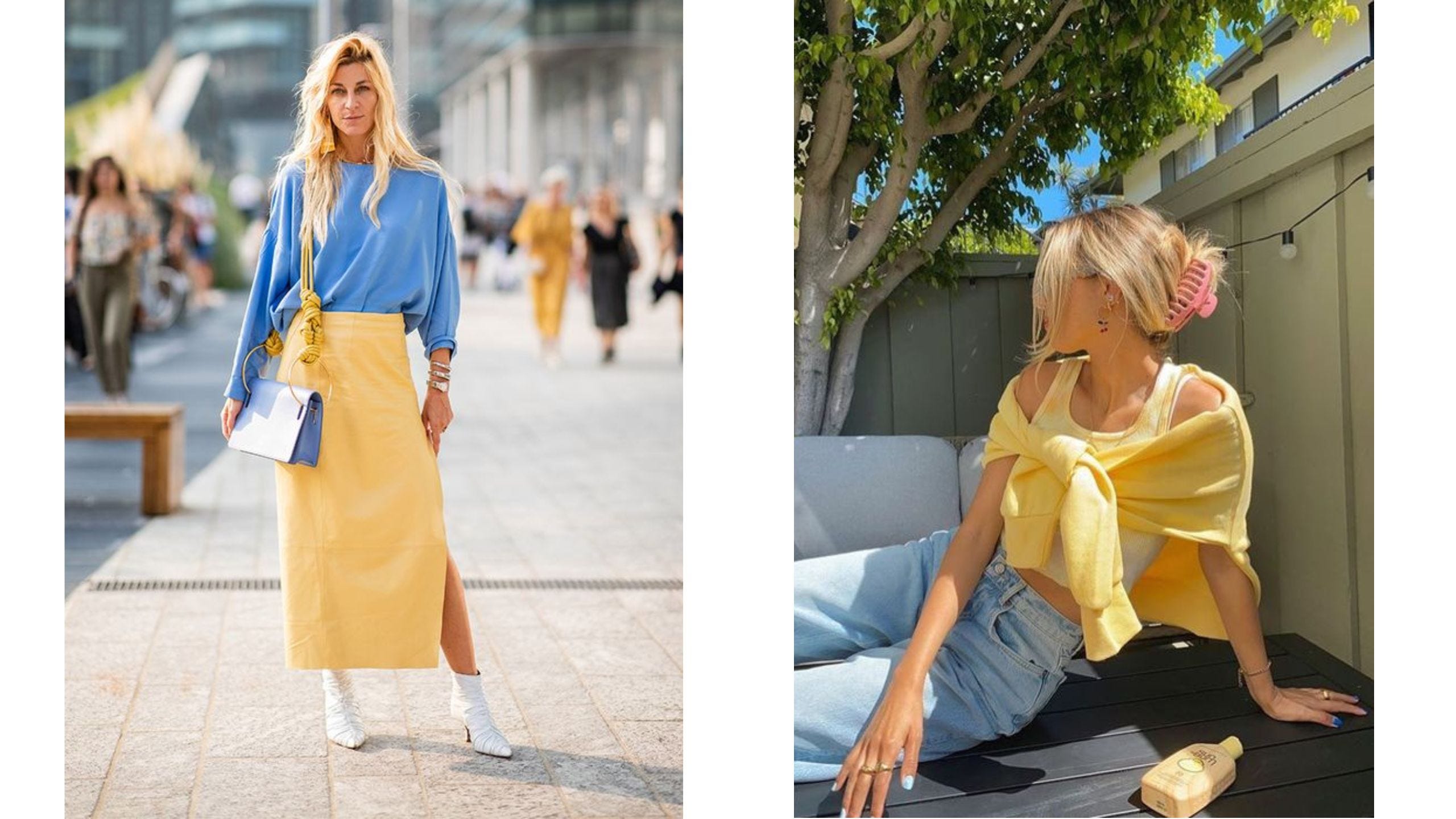
Here are some of the bluest runway looks from spring fashion week.
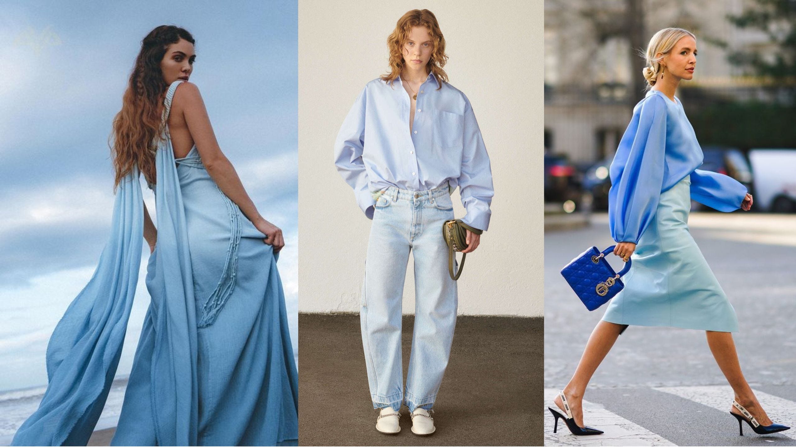
Some snapshots of the trend in a photo sequence: practical, progressive, off-the-rack suits:
Though it sounds too good to be true, the Joker being the eidolon of purple and green separates may soon be a thing of the past.
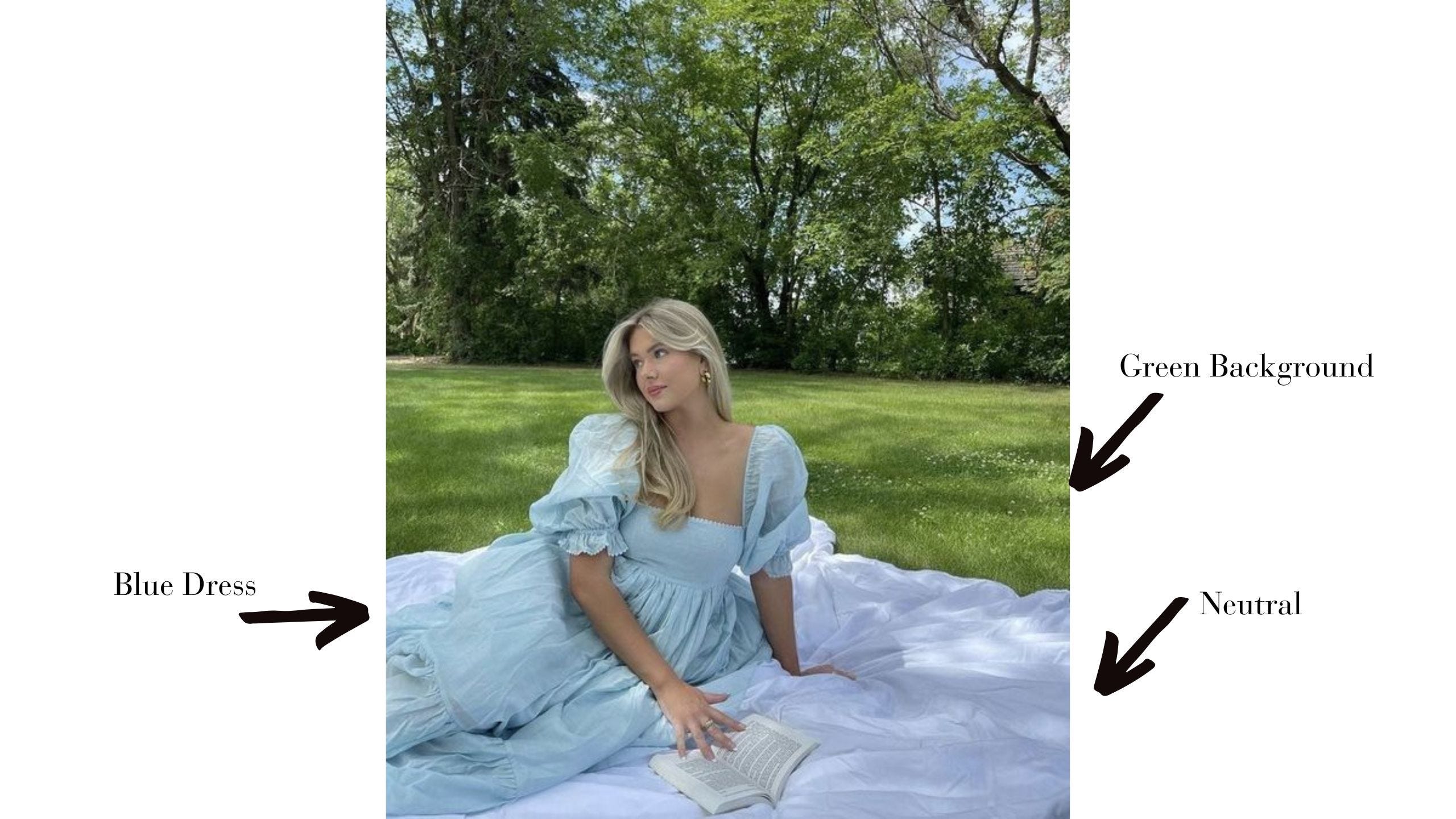
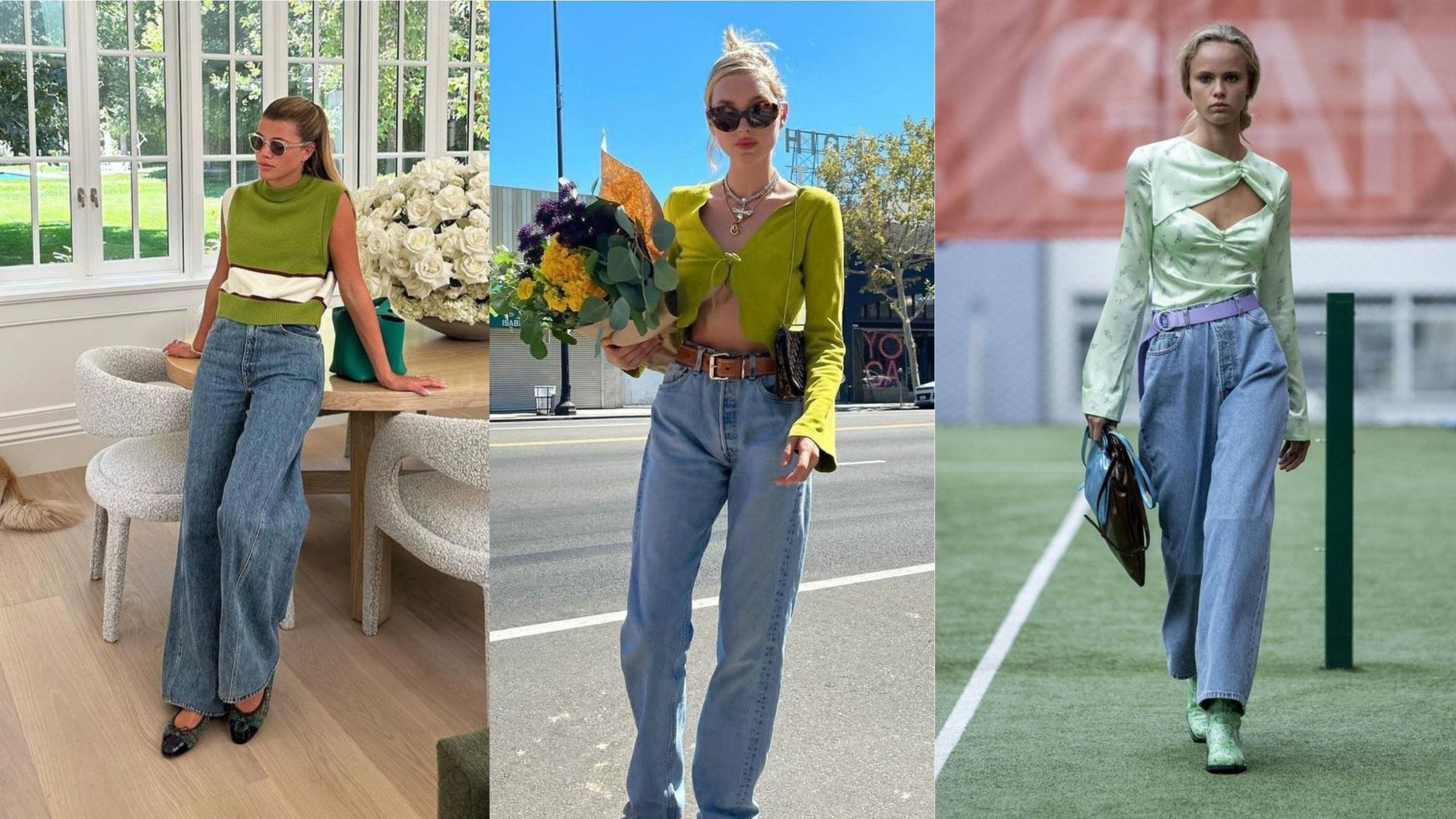
Also, bear in mind that your palette is not limited to clothing. In the above photo, the model dressed in monochromatic fashion, yet her palette predominated in analogous colors: green (grass), blue (dress), and maybe purple (picnic blanket). How trendy!
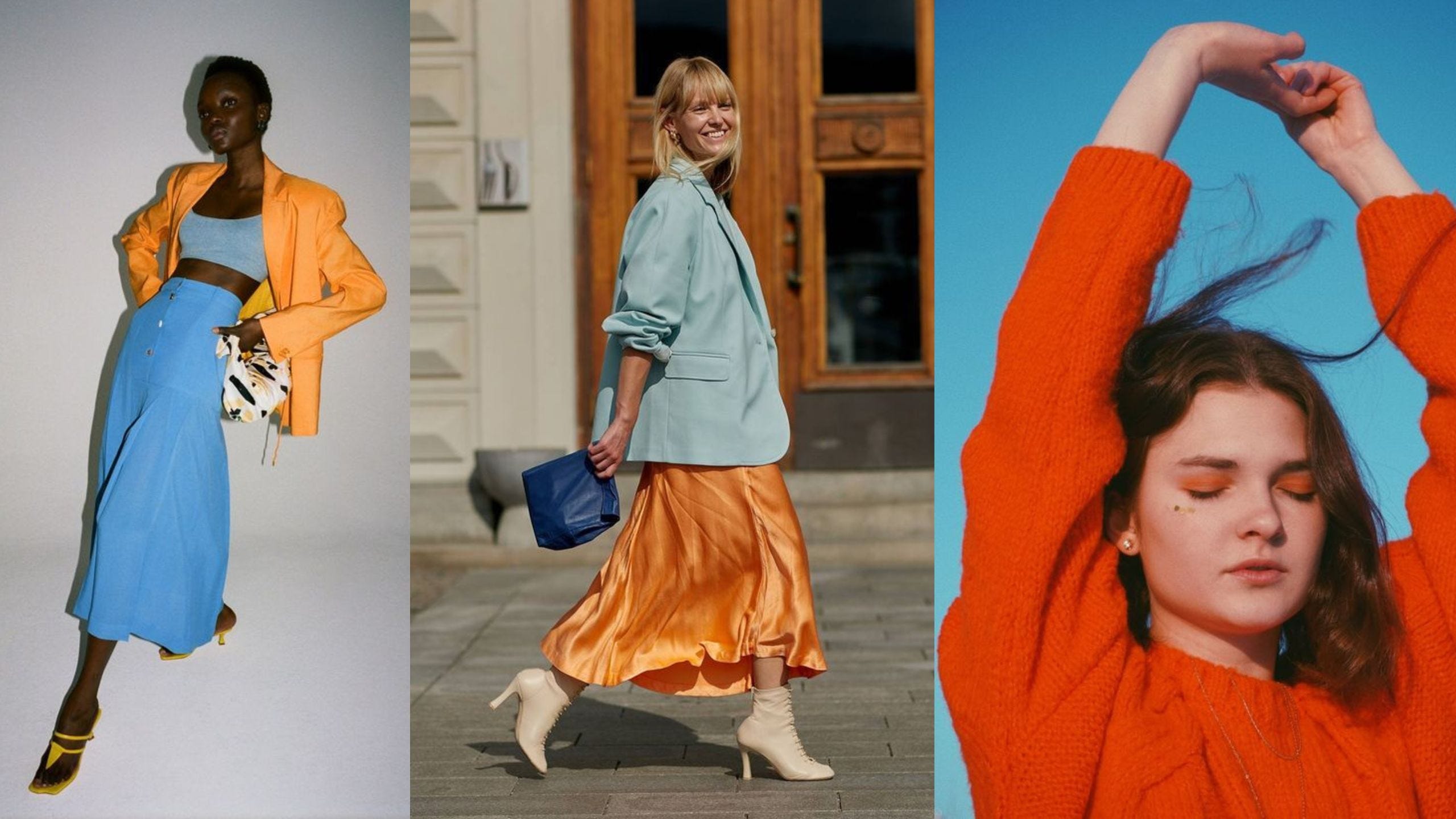
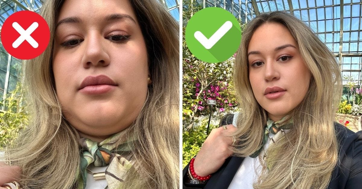
Note the picture on the right-hand side, how the orange pops against the cerulean blue sky. Here, once again, the complementary colors come together in a union of the clothing worn by the photographic subject and the background design, which creates harmony. This is a principle of the visual arts and graphic design. It also is elementary proof that our cinderella pictured hereinabove was not, in fact, a few sandwiches short of a picnic. Neither was our model here, despite her balanced yoga posture up in the tree bearing no green on an outshooting limb.
2. Don’t just say your vanity egged you on, compose yourself with makeup.
All fashion is dress, but not all dress is fashion. Dress is the total arrangement of all outwardly detectable modifications to the body itself and all material objects added to it. In other words, dress includes the apparel and accessories of fashion you wear plus your makeup and hairdo and any other alteration you make to the human body (as by piercings and tattoos) or a body of work (as in your photography). So here a one-piece combination of coveralls and shirt is only one piece of the cover-all provisions needed for trending spring. If you want to make your selfie trendy AF, you need to dress up that blue-jeaned aesthetic with a monochromatic or complementary or analogous cosmetic, then I dress my hair with the little chrysanthemums—more on that later. For now, consider a spring mix of colorful eye shadow, rouge, and mascara.